Why Forms Are the Heart of Every Website
Every website has a goal, and almost every goal eventually leads to a form. Whether it is a contact form, newsletter signup, checkout flow, booking request, or quote estimator, forms are the bridge between curious visitors and committed customers. Despite their importance, forms are often the most overlooked component of web design. Poor form design quietly kills conversions on otherwise beautiful websites.
Effective web design form strategy combines visual clarity, friction reduction, accessibility, and trust signals. When done well, forms feel effortless. When done poorly, they create hesitation, frustration, and abandonment. Understanding what makes a form succeed is essential for any business that wants to turn web traffic into measurable results.
Get Expert Form Design With AAMAX.CO
Businesses that want forms designed for maximum conversion can rely on AAMAX.CO, a full-service digital agency known for blending strategy, design, and engineering. Their team approaches form design as a conversion science, optimizing every field, label, and button for usability and trust. Through their website development services, they build forms that integrate seamlessly with marketing platforms, CRMs, and payment gateways while remaining visually elegant.
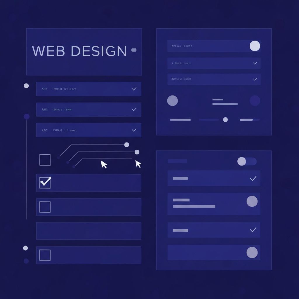
Principles of High-Converting Form Design
The most successful forms follow a few timeless principles. First, they ask only for what is necessary. Every additional field reduces completion rates, so designers should challenge each input and remove anything that is not essential. Second, they group related questions logically and use whitespace to keep the form feeling light. Third, they use clear, descriptive labels positioned above each field rather than relying on disappearing placeholder text.
Visual hierarchy also matters. The submit button should be the most prominent element on the form, with strong color contrast and an action-oriented label such as "Get My Free Quote" or "Start My Trial" instead of generic words like "Submit". Even small wording changes can lift conversions significantly.
Reducing Friction at Every Step
Friction is the silent killer of form completions. Every moment of confusion, hesitation, or annoyance increases the chance a visitor will leave. Designers can reduce friction by enabling autofill, using smart defaults, validating inputs in real time, and providing helpful inline error messages instead of generic alerts.
Multi-step forms are an excellent way to handle longer processes. By breaking a long form into digestible steps with a progress indicator, the experience feels manageable rather than overwhelming. Studies consistently show that well-designed multi-step forms outperform single long forms in completion rate.
Mobile-First Form Design
The majority of web traffic now comes from mobile devices, which means forms must be designed for thumbs first. That includes large tap targets, properly typed input keyboards, single-column layouts, and minimal typing through dropdowns, toggles, and auto-suggestions where appropriate.
Mobile form fields should be tall enough to tap easily, spaced enough to avoid mis-taps, and free of zoom-triggering font sizes. A form that looks fine on desktop but cramped on mobile will lose a huge portion of potential conversions before the visitor even attempts to fill it out.
Accessibility and Inclusivity
Accessible forms are better for everyone. Proper labels, ARIA attributes, keyboard navigation, focus states, and descriptive error messages ensure that users relying on screen readers or assistive technologies can complete the form successfully. Inclusive design also benefits SEO and reduces legal risk for businesses operating in regions with strict accessibility regulations.
Designers should test forms with keyboard-only navigation and screen readers, not just visual previews. Even small adjustments such as associating labels with inputs and using semantic HTML elements can dramatically improve the experience for users with disabilities.
Trust Signals and Privacy Reassurance
Visitors are increasingly cautious about sharing personal information online. Effective form design integrates subtle trust signals such as security badges, brief privacy assurances, and visible references to data protection policies. A short note like "We will never share your email" placed near the email field can noticeably improve conversions.
For higher-stakes forms such as payment or registration, displaying SSL indicators, recognizable payment logos, and reviews from real customers can ease anxiety and encourage completion.
Validation, Errors, and Confirmation
Real-time validation helps users correct mistakes immediately rather than after a failed submission. Errors should be specific, friendly, and actionable, telling users exactly what went wrong and how to fix it. Generic messages like "Invalid input" frustrate users and increase abandonment.
The form journey does not end when the user clicks submit. A clear confirmation page or message reassures the visitor that their action was successful and explains what happens next. This is also a prime opportunity to deepen engagement with related resources, social links, or scheduling options.
Analytics and Continuous Optimization
Forms should be measured, not just designed. Tracking field-level analytics, drop-off points, time-to-complete, and submission rates reveals exactly where users struggle. This data fuels continuous improvement, allowing designers to test labels, layouts, button colors, and field orders in pursuit of better conversion rates.
A form that converts well today may not perform as well in six months. Regular A/B testing keeps performance strong as audience behavior, devices, and design trends evolve.
Conclusion
A well-crafted web design form does far more than collect information; it shapes the entire conversion experience. By focusing on clarity, accessibility, mobile usability, trust, and continuous testing, businesses can transform forms into high-performing growth tools that convert traffic into measurable revenue.