The Web at the Turn of the Millennium
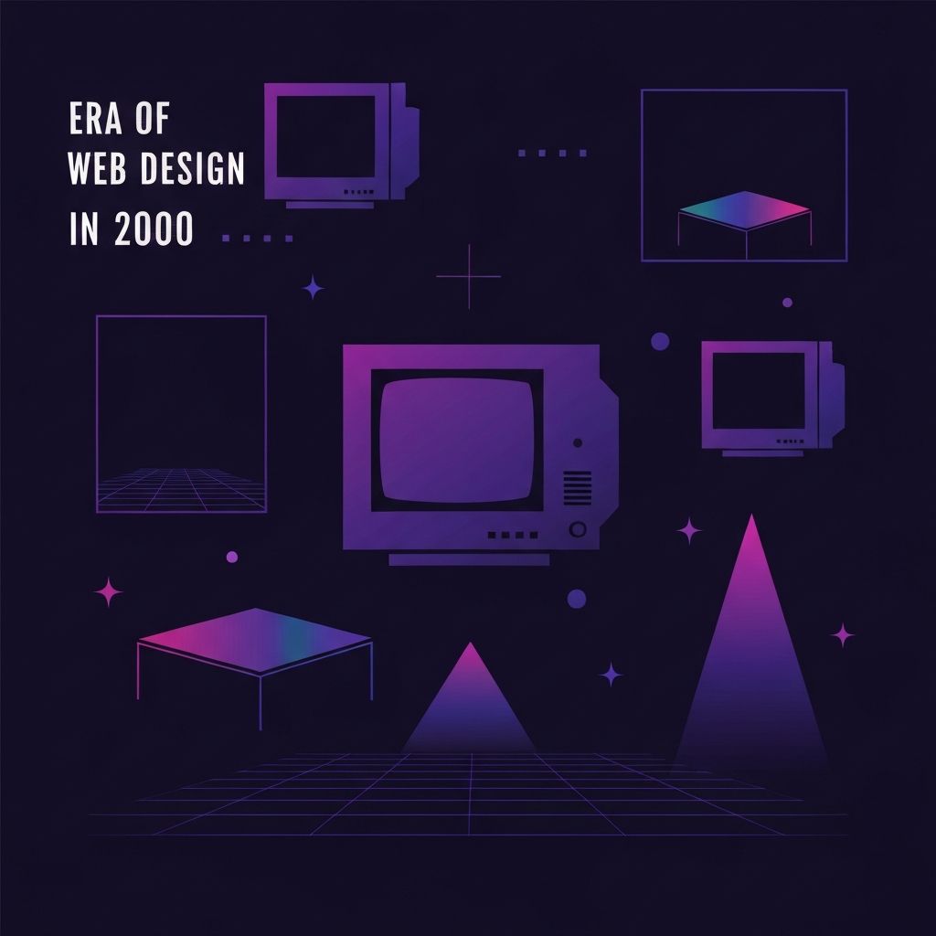
Web design in the year 2000 stood at a unique crossroads. The novelty of the early internet had given way to a more mature, business-driven web, but the tools, browsers, and standards were still catching up to designers' ambitions. Sites of this era often combined visual experimentation with technical workarounds, producing layouts that were creative, sometimes chaotic, and deeply reflective of a moment when the rules of digital design were still being written.
This was the period of table-based layouts, sliced images, animated GIFs, and splash screens. Designers leaned heavily on Adobe Photoshop and Macromedia Fireworks to mock up pixel-perfect designs, then used HTML tables and spacer GIFs to recreate those mockups in browsers. It was painstaking work, but it laid the groundwork for the more elegant, standards-based approaches that would follow.
Hire AAMAX.CO for Web Design and Development Services
Modernizing a legacy website that still carries traces of early-2000s design patterns can feel daunting, but it does not have to be. AAMAX.CO specializes in helping businesses transform outdated websites into fast, accessible, and conversion-focused digital experiences. Their team understands the architectural decisions that defined that era and they know exactly how to migrate, restructure, and rebuild older sites using current best practices, all while preserving the brand equity that has been built over the years.
Table-Based Layouts and Pixel Precision
The most defining technical characteristic of web design in 2000 was the heavy reliance on HTML tables for layout. Designers would slice a Photoshop comp into rectangular pieces and assemble them inside nested tables, often with single-pixel transparent GIFs holding cells to exact widths. While this approach was inflexible and inaccessible, it allowed designers to achieve relatively complex visual layouts at a time when CSS support across browsers was inconsistent at best.
This pursuit of pixel precision shaped a generation of designers who understood typography, alignment, and grid systems at a deep level. Many of those skills carried over into the responsive era, even as the underlying technology changed completely.
The Browser Wars and Their Impact
The early 2000s were dominated by browser inconsistencies. Internet Explorer held a commanding share of the market, but Netscape was still relevant, and emerging browsers were beginning to challenge the status quo. Each browser interpreted HTML and CSS slightly differently, forcing designers and developers to write code that worked in one environment and degraded gracefully in others.
This fragmentation gave rise to a culture of testing, hacks, and conditional comments that lingered for years. It also fueled the push for web standards, ultimately leading to the more reliable, predictable web we enjoy today.
Visual Trends That Defined the Era
Visually, websites in 2000 were a colorful, sometimes overwhelming, blend of trends. Splash pages with animated intros were common, especially for entertainment and corporate brands eager to make a strong first impression. Pixel fonts, drop shadows, beveled buttons, and skeuomorphic icons appeared everywhere. Marquee text and blinking elements, while already considered tacky by some, still showed up regularly on smaller sites.
Color palettes ranged from corporate blues and grays to bold, saturated combinations that pushed the limits of the limited web-safe palette. Designers worked within the constraints of 216 web-safe colors and slow dial-up connections, which meant every visual decision had to be weighed against file size and load time.
Flash and the Rise of Interactive Experiences
No discussion of web design in 2000 is complete without mentioning Macromedia Flash. Flash gave designers the ability to create rich, interactive, vector-based experiences that simply were not possible with HTML alone. From animated navigation menus to fully immersive microsites, Flash unlocked a level of creativity that captured the industry's imagination.
While Flash eventually fell out of favor due to performance, accessibility, and security concerns, it played a crucial role in expanding what people believed the web could do. Many of the principles it pioneered, including motion design, micro-interactions, and immersive storytelling, are now achieved using modern web technologies in much more efficient ways.
The Beginnings of Standards-Based Design
By the year 2000, voices in the design community were beginning to advocate for a cleaner, more structured approach to building websites. The Web Standards Project pushed for browsers to adopt consistent implementations of HTML, CSS, and the DOM. Forward-thinking designers started exploring CSS for layout rather than just typography, planting the seeds of the standards-based revolution that would fully bloom in the following years.
This shift was as much philosophical as it was technical. It encouraged designers to think about content structure, semantic markup, and accessibility, rather than treating the web as a digital print medium. Investing in modern website development today directly benefits from those early conversations about separation of structure, presentation, and behavior.
E-commerce Finds Its Footing
By 2000, e-commerce had moved beyond novelty and was becoming a serious driver of web design decisions. Businesses needed product catalogs, shopping carts, and checkout flows that were trustworthy and easy to navigate, even on slow connections. Designers had to balance branding with usability, ensuring that purchase paths were clear and friction was minimized.
The lessons learned during this period continue to influence how online stores are built today. Trust signals, clear pricing, simple navigation, and reassuring confirmation pages all have roots in the e-commerce experiments of the early 2000s. Modern website design now extends those principles into omnichannel experiences that span phones, tablets, desktops, and beyond.
Lessons from the Year 2000 for Today's Designers
Looking back at web design in 2000 offers more than nostalgia. It highlights how technical constraints can fuel creativity, how cross-browser inconsistencies forced disciplined thinking, and how the absence of mature tools made designers more resourceful. It also underscores how quickly the industry evolves and how important it is to revisit and modernize older digital assets.
For brands still operating with websites that reflect the assumptions of two decades ago, the path forward is clear: embrace standards, prioritize performance, and invest in experiences that meet modern expectations. With the right partner guiding the journey, the rich history of early web design can become a launchpad rather than an anchor.